giftster
People are always having trouble choosing gifts for others. They do not know what to buy.
Help users find gifts faster by giving suggestions, sharing gift ideas, sharing wishlists.

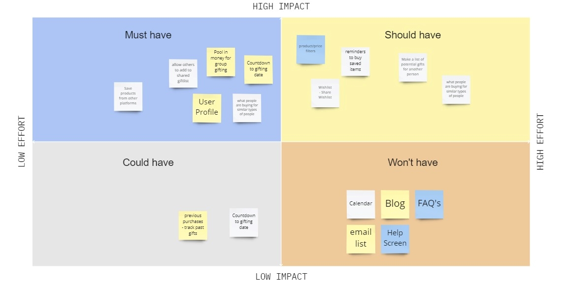
We had a lot of ideas but didn't know exactly what we wanted to have. Here, we were able to prioritize different ideas.
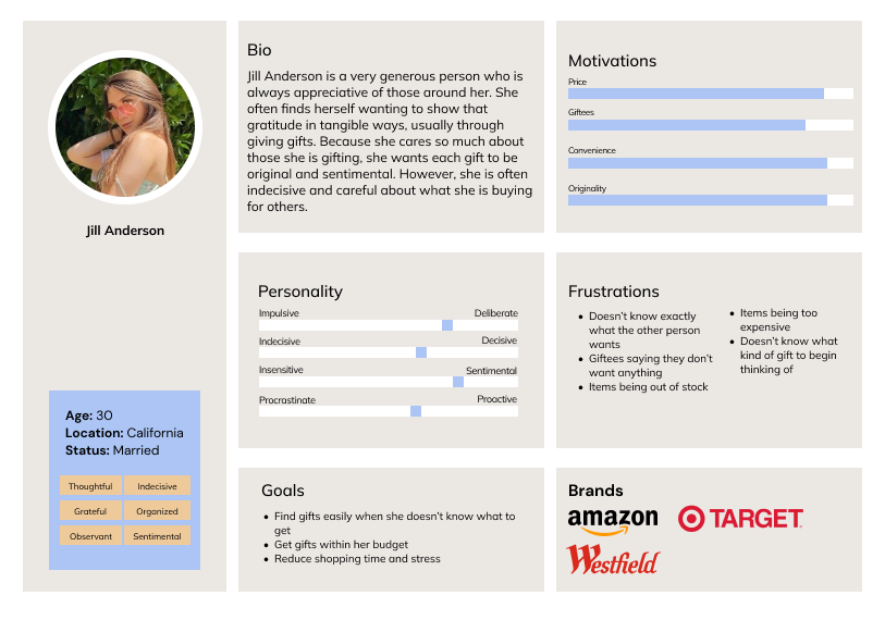
We created a questionaire that asked about the gift buying process, motives, and feelings throughout. Data and information collected from interviews formed our persona.
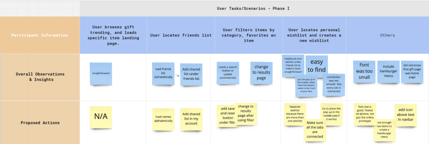
In this round of testing, most users said the app was straightforward. One suggested the pop ups appear in the center of the sreen while one could not find the favorite button, only the save button.
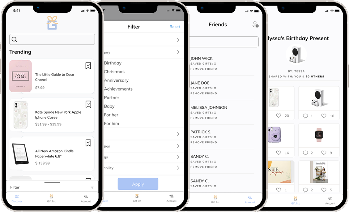
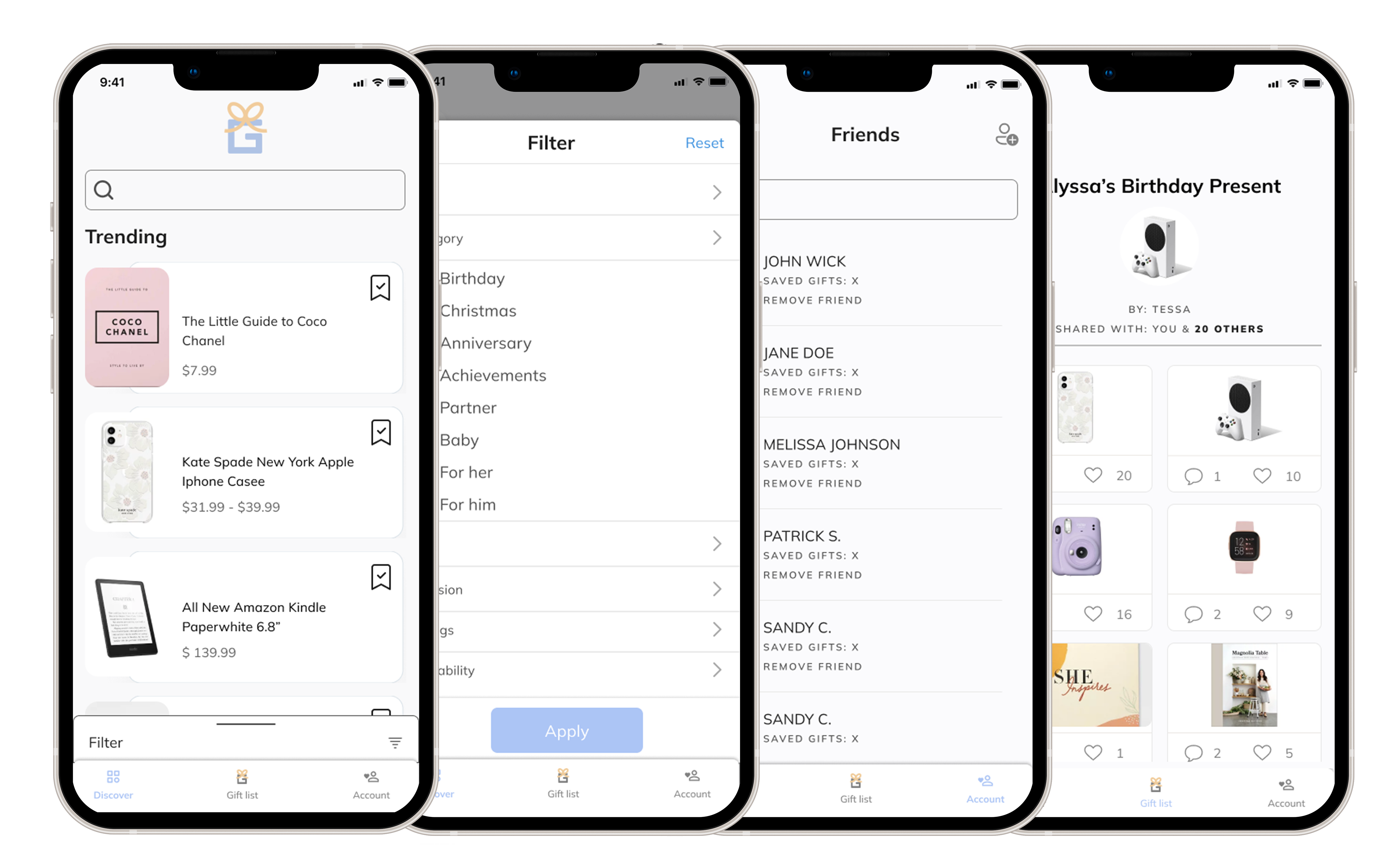
We came up with our color palette through keywords such as clarity, calm, and relaxed. We wanted users to feel comfortable and clear when searching through our app. We decided on the muted blue as our primary color and yellow as our accent. We also went for a modern font that would keep the app clean, simple, and readable.
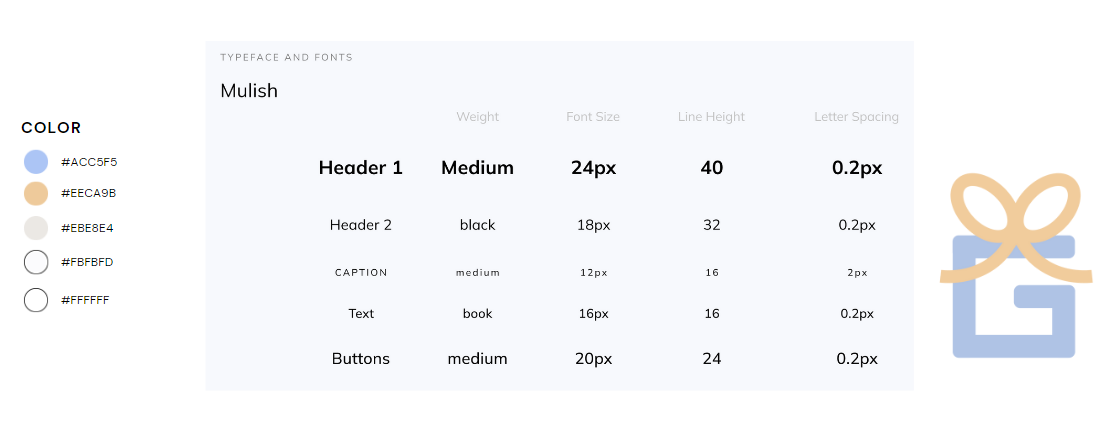
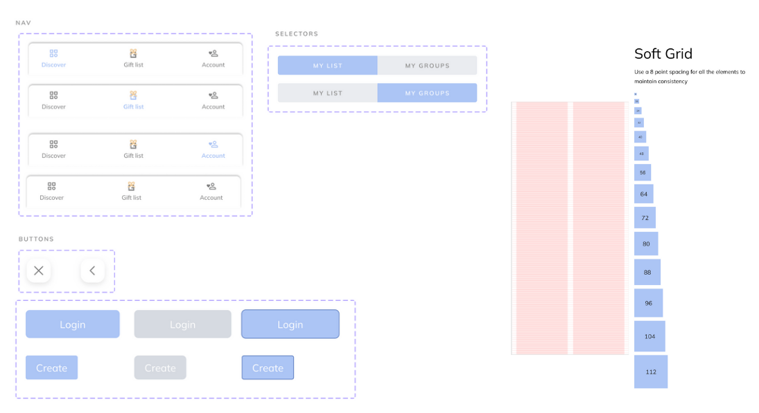
For our logo, we decided to use a simple illustration with a G for Giftster and a bow to show off a gift. We made it into a gif for the opening page. Our icons are commonly used icons that can be easily recognized by users. We want users to be able to use the icons as if they want to glance past the text.
Our navigation bar varies based on the page you are on. The current page will be highlighted in blue to indicate what page the user is currently on. Our go back and exit buttons are simple, and white with a drop shadow to stand out on the page. Then we ahve our login/create buttons and our page selectors that vary in colors based on what toggle state a user is in. The blue indicates being on the selected page of button. We used a grid system for our design that would go up by 8s to keep consistency on all our pages in the app.